Project Details
- Structural Engineer: ARUP
- M&E Engineer: ARUP
- Lighting Consultant: Brandston Partnership Inc
- Builder: Gennal Industries
- Graphics: Tripple
- Branding, Logo Design & Marketing Collaterals Collaborator: TRIPPLE
- Client: GAW Capital Partners, Manful Wings Pte Ltd
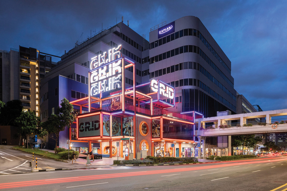
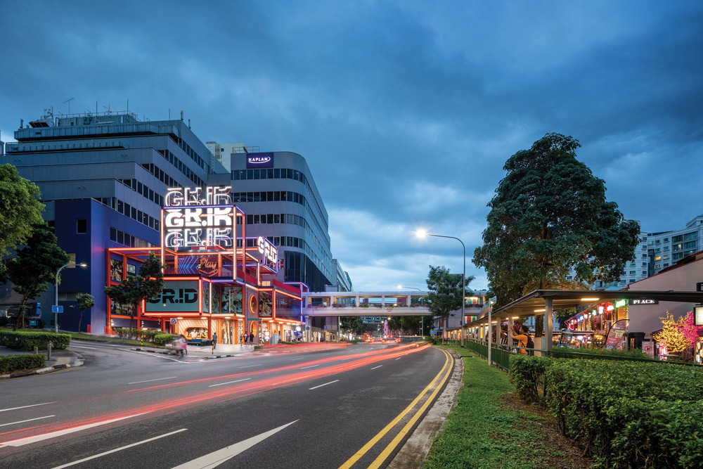
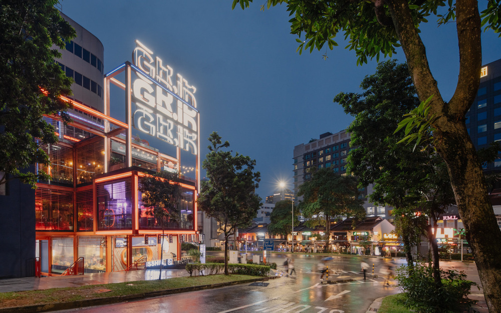
Spark introduces GRiD, a youth focused mall and education hub at the heart of Singapore’s Selegie Arts District, sandwiched between the adjacent School of the Arts (SOTA) and several time-worn shopping malls. GRiD is the next chapter in this narrative and a great example of vibrant retrofitting of an existing building that extends its community relevance through positive reuse, rather than wholesale demolition and re-construction.
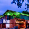
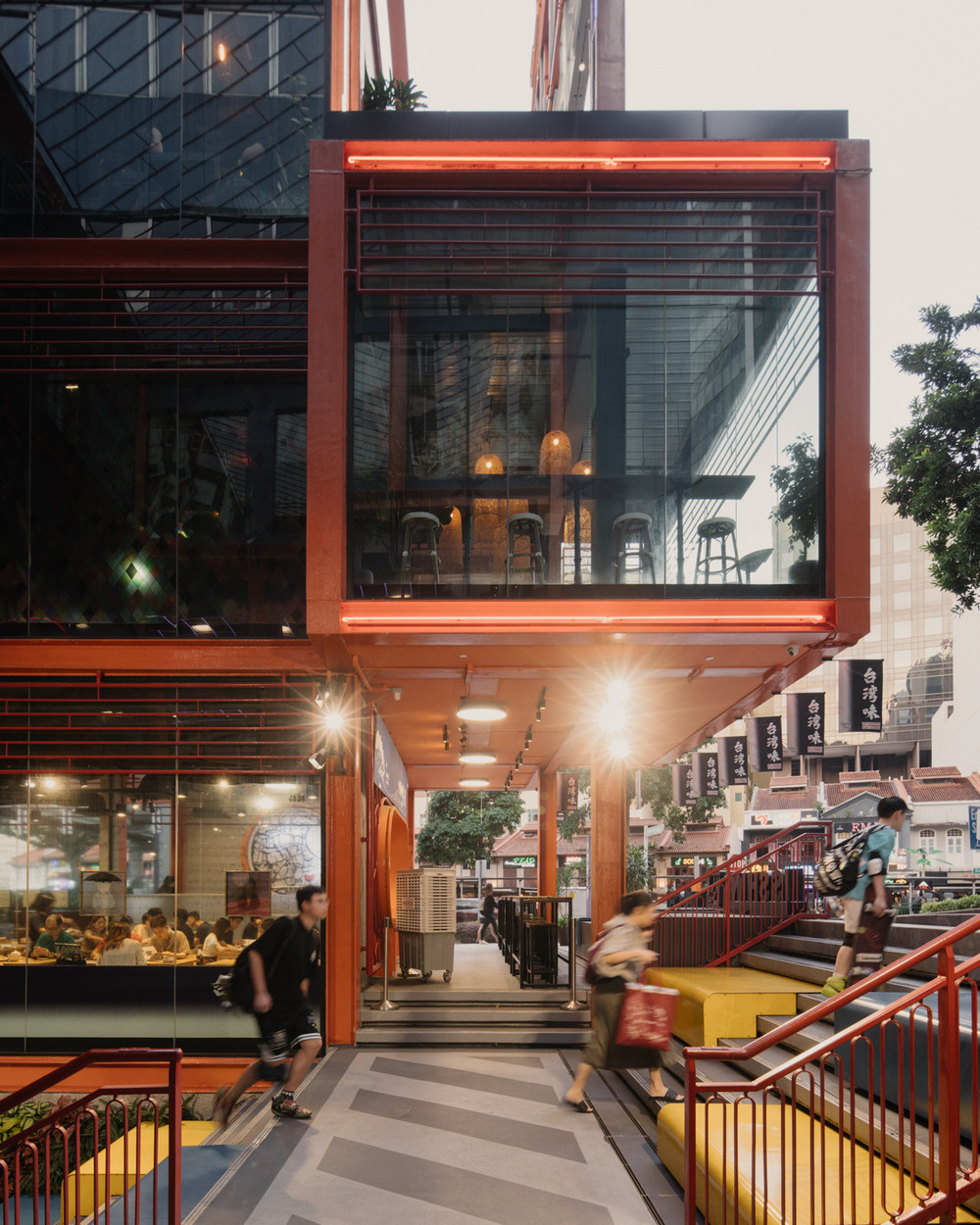
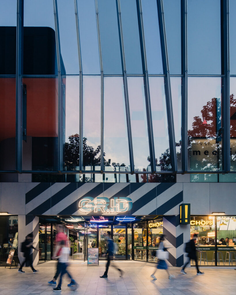
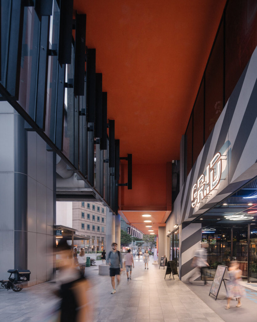
The metamorphosis of GRiD’s street-corner into a “beacon” and attractor, as well as housing an increased quantum of high revenue generating F+B units, is SPARK’s signature gesture and a cultural “nod” to the night-time luminosity of the local shophouses.
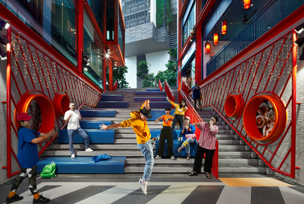
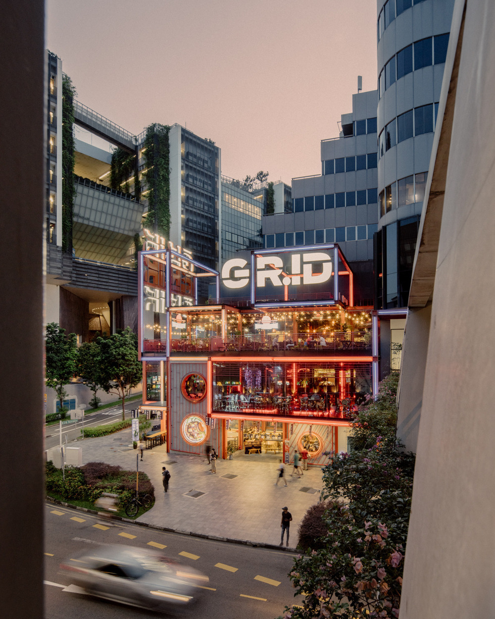
A new ‘social stair’, a key component of the dynamic new corner is located opposite SOTA, driving footfall to “food joints” in the basement. The stair is a place to relax with friends, watch onscreen shows, or enjoy live performances by GRiD’s arts focused tenants.
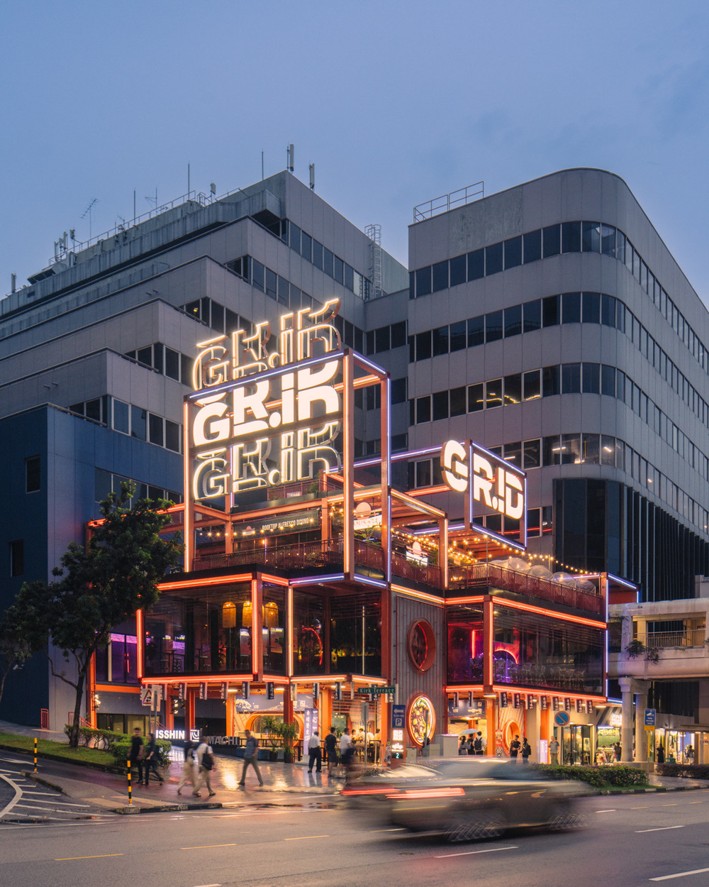

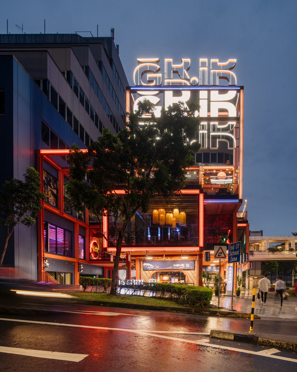
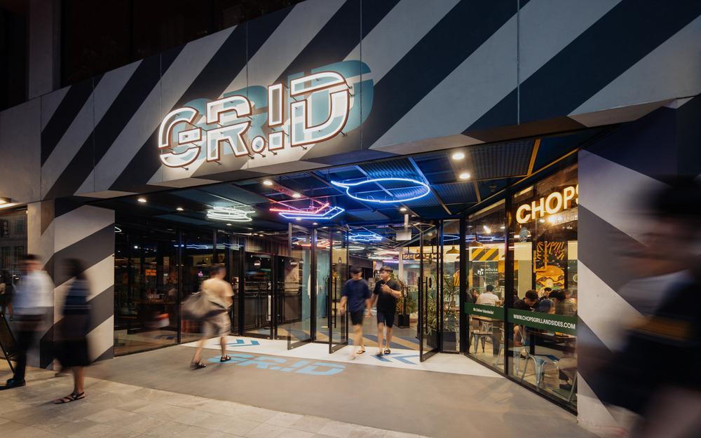
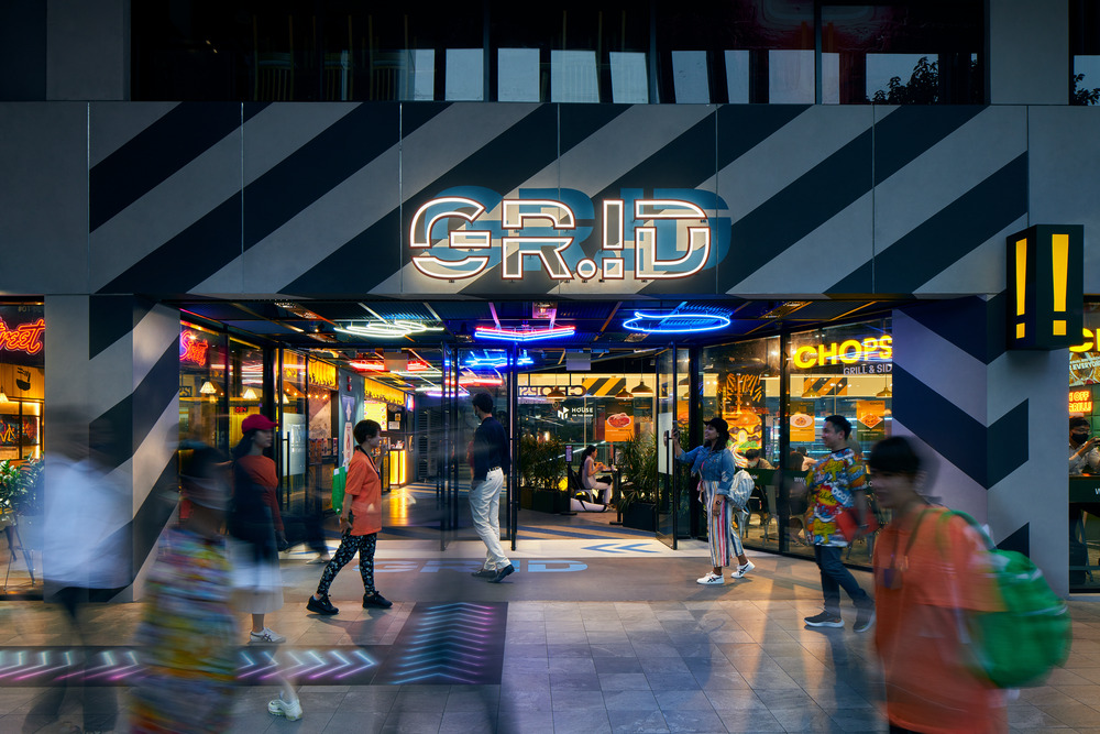
The corner shops and social stair have become a vibrant digital generation friendly “instagrammer” canvas for content creators and experience seekers. GRiD has been deliberately designed to stand apart. The energy of the exterior is carried into the interior spaces, redolent of a post-industrial aesthetic with neon lights and supersized utilitarian graphics.
Design description
GRiD sits at the heart of Singapore’s Arts District, sandwiched between SOTA (School of the Arts) and Park Lane and Peace Centre, two of Singapore’s older generation of shopping malls. GRiD is a great example of a positive transformation of a failing building into a socially focused youth retail and education hub for the community. The upgrading work is centred on the core purpose of increasing asset value through social interaction, increased accessibility, and the celebration of self and community.
Key elements
1. Transformation of the Building Image
The primary gesture is the transformation of the building’s corner, it’s key address, and threshold to the street. The reenvisioned corner becomes the building “beacon” and attractor, a vibrant digital generation friendly “instagrammer” canvas for content creators, and experience seekers.
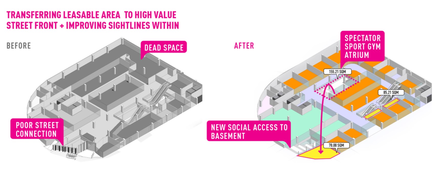
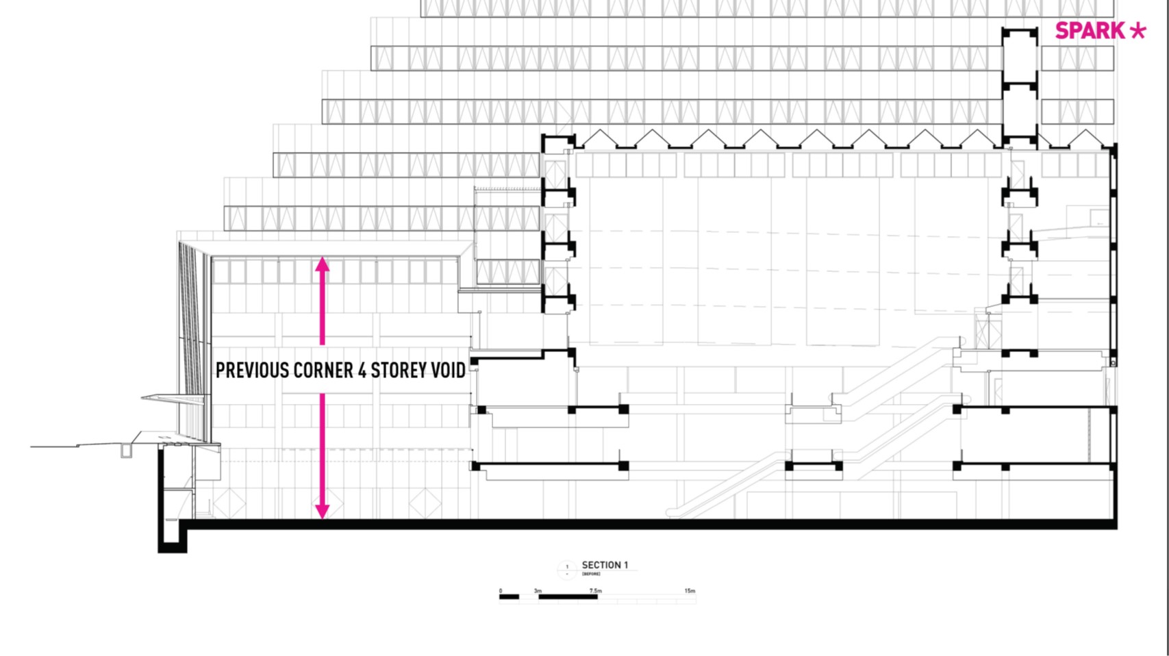
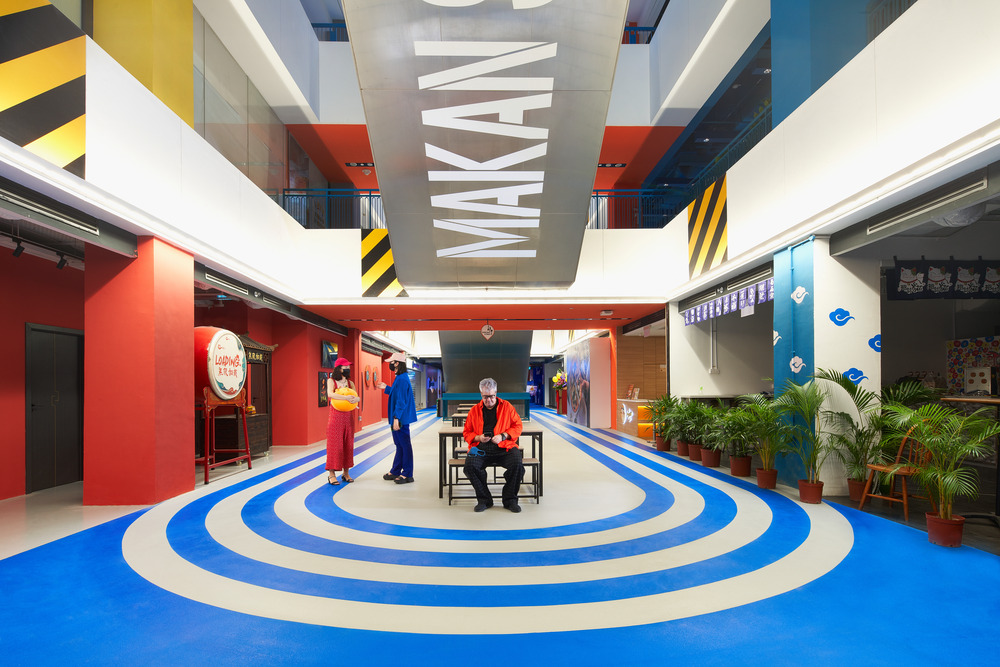
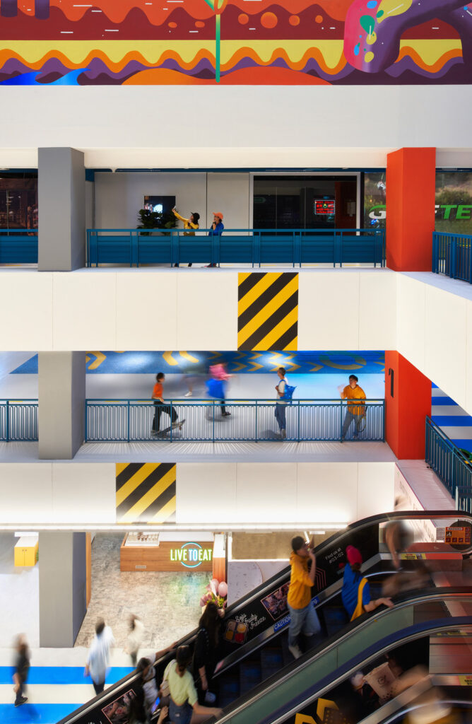
The multilevel, high rent ‘flagship’ corner is the result of moving low rental value shops from deep parts of the building interior to the easily accessible and high visibility street corner. The low value shops were “voided” out to create visual and spatial connections from the ground floor into a double volume gymnasium in the basement.
2. Programmatic mix to suit client objectives
An increased quantum of youth focused “food joints” are located at the transformed corner, replacing an unproductive 4-storey void. The new corner facilitates great Al fresco dining spaces with terraces that increase visibility to and from the building and, importantly, underpinning the notion of urban interaction.
Key facts on the leasable area increase:
- Area at key corner threshold: 50%
- Area along street front: 35%
Social Stair
A new ‘social stair’ is introduced adjacent to the School of the Arts (SOTA), an important part of the dynamic new corner and a place to relax with friends on benches watching shows onscreen, or live performances, in a naturally ventilated triple volume space. The stair volume provides more façades for the restaurants and creates a socially focused addition to the arts district urban grain.
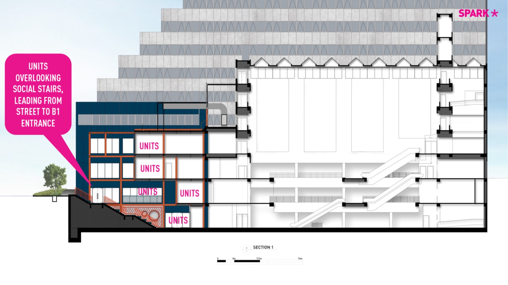
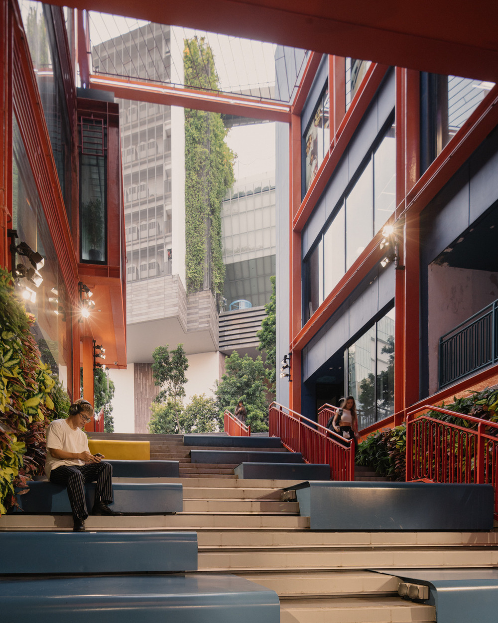
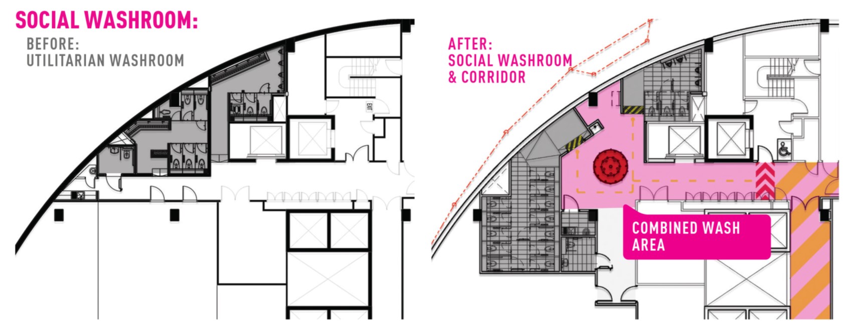
The social staircase provides direct access to the basement, food street, and other “attractor” facilities like the ‘social washroom’, public study and work zones, vending machines, and lockers, all designed to transform utilitarian functions into social spaces.
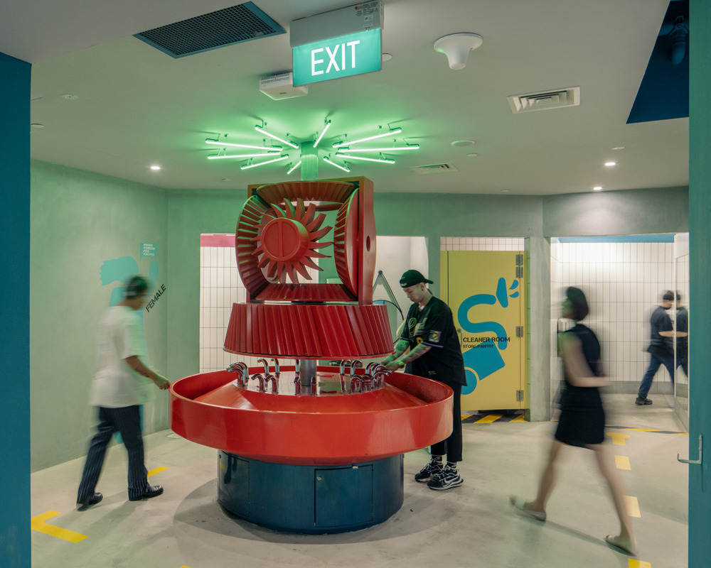
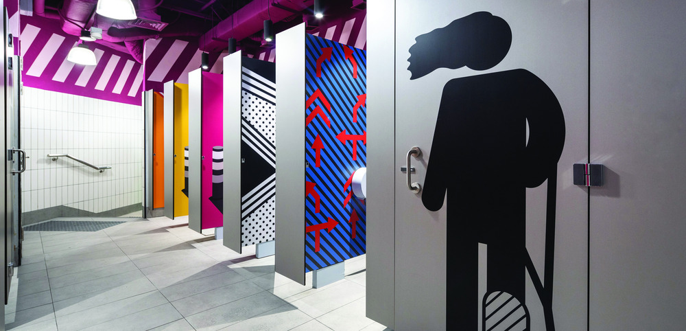
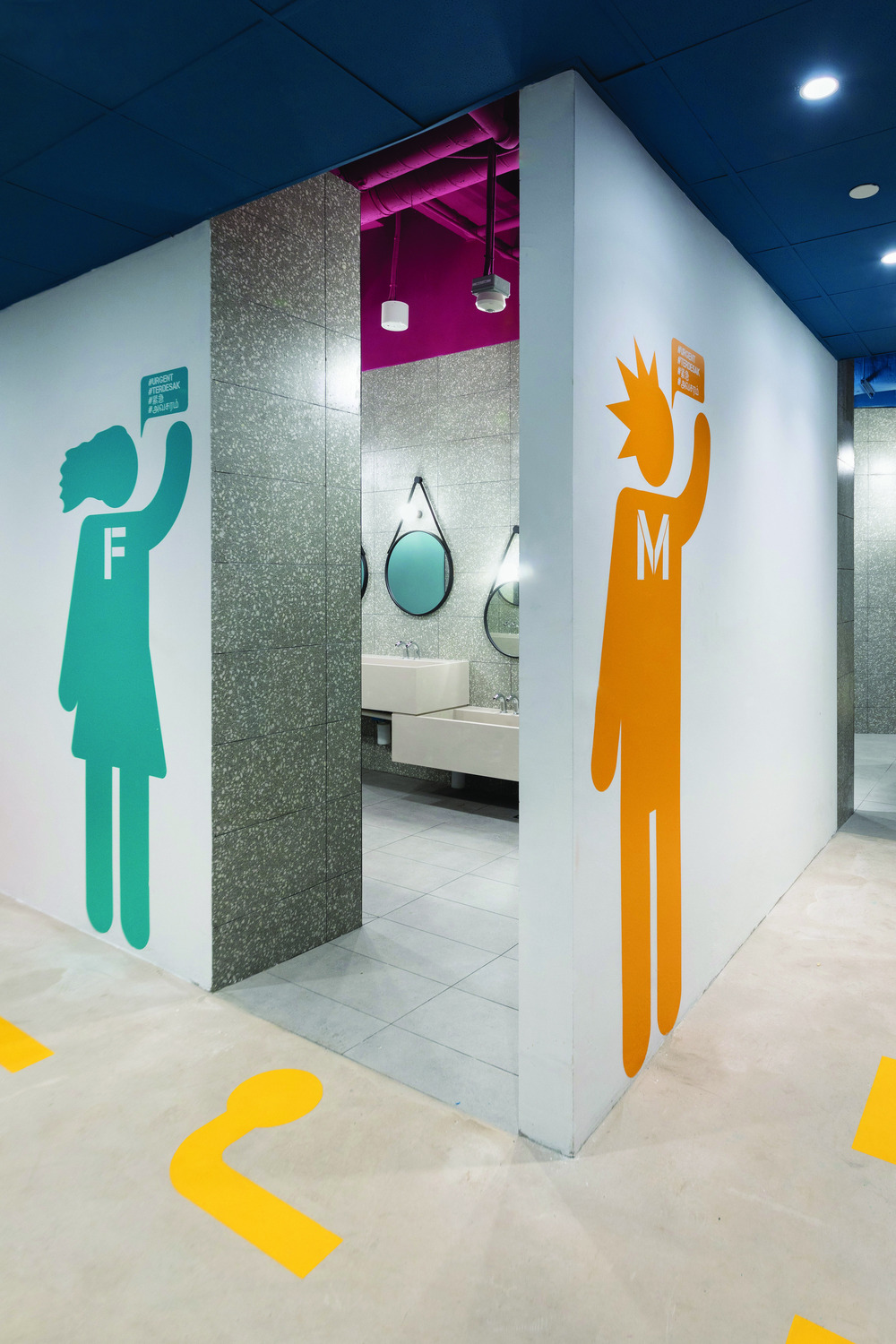
Social Washroom
The impact of mobile gadgets and social media on everyday life inspired SPARK’s design of utilitarian space into positive places for chance meetings, gossip sessions, and image creation, while taking a break between shopping, education, or work. The social washroom’s bespoke post-industrial washbasin and WC cubicles are designed to be “photobooth” backdrops, with super graphics which prompt fun and unexpected spontaneous selfies.
Branding Design. GRiD
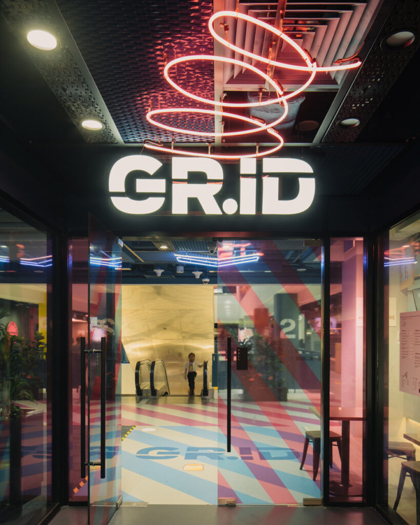
The new corner restaurants and interior of GRiD create a positive convergence of social spaces with multiple platforms for self-expression, located at a city junction which is in a constant flux of people flow vibrancy and energy. The building is graphically personalized with a slot machine style jackpot GRiD Logo, the letter “i” representing “self”.
The “GRiD” building and brand name was developed by the design team and has been integrated into the design of the facade, entrances, wayfinding, and interior design.
Setting the stage with graphic interior design and wayfinding
The post -industrial material palette embodying the spirit of grunge, freestyle expression, and arcade neon renders GRiD generationally different to its neutral neighbours, instead taking its colourful character from the vibrantly illuminated shophouses across the street.
The supersized road marking graphics and neon logos are a real life stage, setting a flux of people and activities supported by GRiD’s urban theme. The urban graphic theme guides users around the building, from street to basement and up through the escalator voids and lift lobbies to the restaurants, shops, and education campus located at the building’s upper levels.
Pop-up stores, remote-working / study zones, and social shared spaces encourage communal events, public interaction, and space sharing.
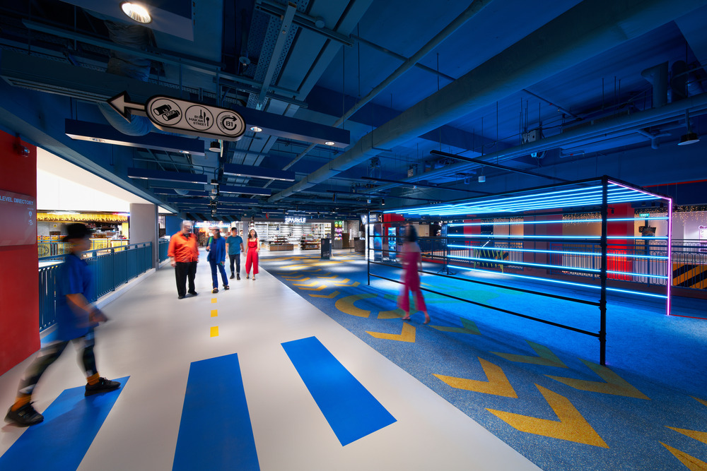
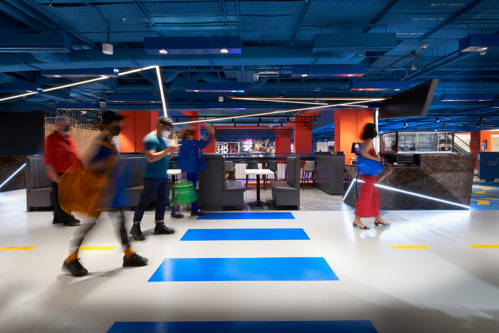
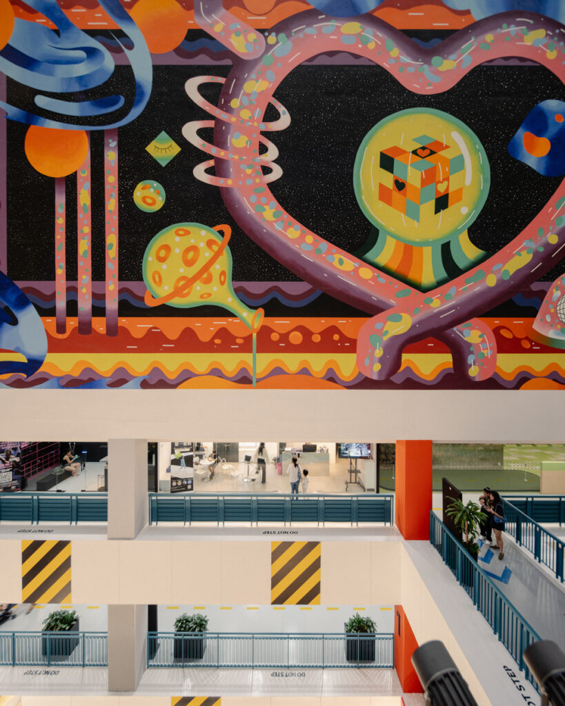
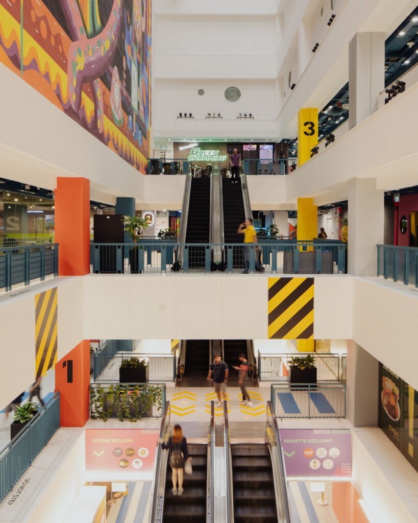
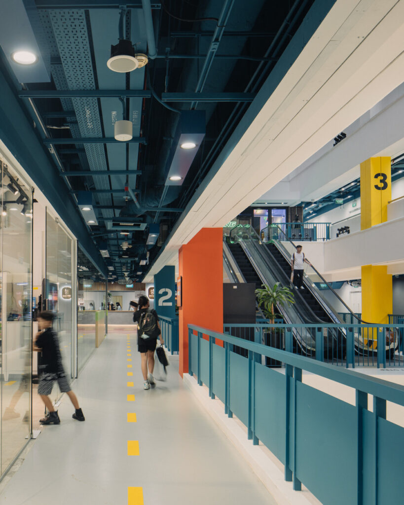
Floor graphics and ceiling patterns incorporate abstract and supersized versions of street directional signage and road markings. Ceiling directional signs guide visitors to key attractor social facilities and tenancy areas within GRiD. Graphic icons are designed for casual youthful insouciance and motion.
SPARK has transformed GRiD into a regenerated place to “be”. A learning campus, a workplace, and a place to socialize, shop, eat, and connect with the local arts community. It is an outwardly looking destination that is social, experiential, and an authentic “local” experience in an offbeat location.

Would you like to publish your projects? Get Started Here