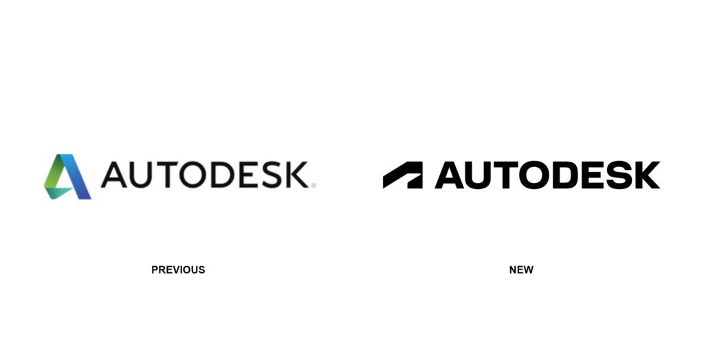
Autodesk recently went through a rebrand rolling out a new brand system, including a new company logo, a new corporate typeface, colours, imagery and design guidelines.
They describe the rebrand as ” the first of several bold moves we’re making as a company to reimagine the Autodesk brand—one that underscores our belief that a better world can be designed and made for all.”
“Dynamic, modern, and memorable“, the new Autodesk logo is said to represent action, momentum, and a clear direction toward the future. The 39 year old software company touts it as a strong, simple logo that illustrates a brand synonymous with doing.
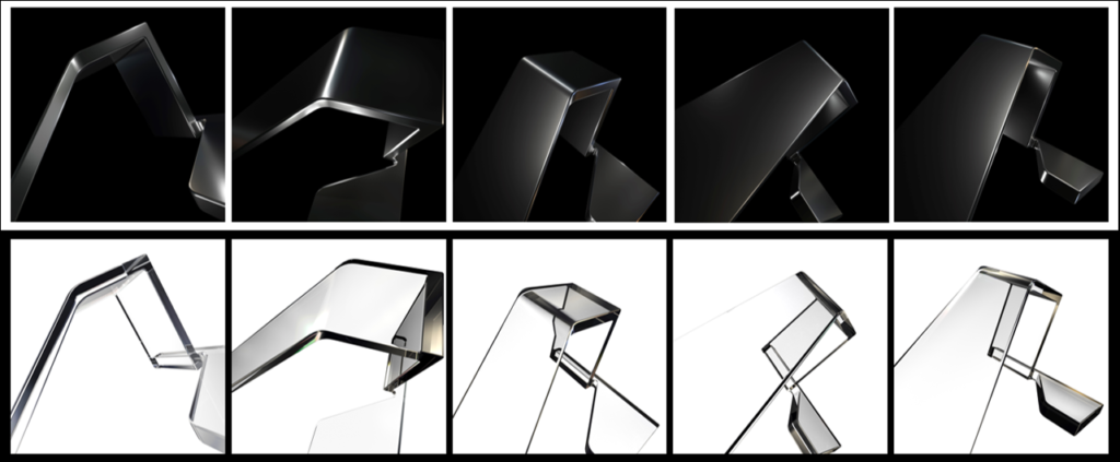
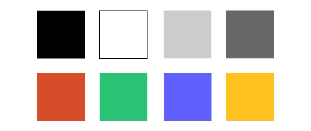
The new brand imagery features abstract 3D geometric forms created by focusing on parts of the symbol in the new logo. The brand colours have also received an update, transitioning from the previous Autodesk blue to a minimalist black and white. These will serve as the two primary colours alongside two detail grays, and four accent colors–clay, plant, iris and gold.
Additional elements of the rebrand such as product identities and icons have yet to be released at the time of the rebrand unveil, but will be announced in the near future. Find out more about the rebrand here.


